Checkout
Top Celebrities
- 50 Cent
- Aaron Carter
- Abigail Clancy
- Academy Awards
- Adam Lambert
- Adam Sandler
- Adnan Ghalib
- Adrian Grenier
- Adriana Lima
- Adrianne Curry
- Adrienne Bailon
- Aida Yespica
- Aisha Tyler
- Aisleyne Horgan-Wallace
- Akon
- Al Gore
- Alaina Alexander
- Alana Curry
- Alec Baldwin
- Aleksandra Jordan
- Alena Seredova
- Alessandra Ambrosio
- Alessia Ventura
- Alex Grace
- Alex Rodriguez
- Ali Larter
- Ali Lohan
- Alicia Keys
- Alina Vacariu
- Allegra Versace
- Alley Bagget
- Alyssa Milano
- Amanda Bynes
- Amanda Harrington
- Amanda Peet
- America Ferrera
- American Idol
- Amy Polumbo
- Amy Winehouse
- Ana Beatriz Barros
- Ana Kournikova
- Anahi Gonzalez
- Andy Dick
- Andy Garcia
- Ang Lee
- Angelina Jolie
- Angie Harmon
- Anna Faris
- Anna Friel
- Anna Kournikova
- Anna Lynne McCord
- Anna Nicole Smith
- Anna Paquin
- Annalynne McCord
- Anne Hathaway
- Anne Heche
- Anthony Hopkins
- Antonella Barba
- Antonio Banderas
- April Scott
- Arnold Schwarzenegger
- Aruna Shields
- Ashanti
- Ashlee Simpson
- Ashley Dupre
- Ashley Greene
- Ashley Olsen
- Ashley Tisdale
- Ashton Kutcher
- Aubrey O'Day
- Audrina Patridge
- Austin Green
- Avril Lavigne
- Bai Ling
- Bam Margera
- Bar Refaeli
- Barack Obama
- Barbra Streisand
- Barron Hilton
- Ben Affleck
- Ben Stein
- Ben Stiller
- Bernie Mac
- Beyonce
- Beyonce Knowles
- Bikini Pictures
- Bill O'Reilly
- Bjork
- Blake Lively
- Bobby Brown
- Bono
- Borat
- Brad Pitt
- Brandon Davis
- Brenda Song
- Bridget Marquardt
- Britney Spears
- Brittany Murphy
- Brittany Snow
- Brody Jenner
- Brook Shields
- Brooke Burke
- Brooke Burns
- Brooke Hogan
- Brooke Shields
- Bruce Willis
- Cameron Diaz
- Camilla Belle
- Candice Michelle
- Caprice Bourett
- Caption Me
- Carmen Electra
- Carrie Prejean
- Carrie Underwood
- Cassie
- Cate Blanchett
- Catherine Zeta-Jones
- Celebrities
- Celebrity Gossip
- Celebrity Pictures
- Celine Dion
- Chad Michael Murray
- Chanelle Hayes
- Charisma Carpetner
- Charlie Sheen
- Charlize Theron
- Cheryl Cole
- Cheryl Tweedy
- Chris Benoit
- Chris Brown
- Chris Tarrant
- Christian Bale
- Christie Binkley
- Christina Aguiera
- Christina Aguilera
- Christina Applegate
- Christina Milian
- Christina Ricci
- Christoper Masterson
- Christopher Walken
- Chuck Nice
- Ciara
- Cindy Crawford
- Cindy Margolis
- Cindy Taylor
- Claudia Schiffer
- Clay Aiken
- Clive Owen
- Coco
- Cory Lidle
- Courteney Cox
- Courtney Cox
- Courtney Love
- Criss Angel
- Cristiano Ronaldo
- Cyndi Lauper
- Dakota Fanning
- Dane Cook
- Dania Ramirez
- Daniel Craig
- Daniel Radcliffe
- Daniel Smith
- Danielle Lloyd
- Danity Kane
- Dannii Minogue
- Danny Boyle
- Dave Navarro
- David Beckham
- David Blaine
- David Faustino
- David Hasselhoff
- David Letterman
- David Spade
- Dean McDermott
- Dean Sheremet
- Debbie Rowe
- Delta Goodrem
- Denise Milani
- Denise Richards
- Dennis Leary
- Diddy
- Dina Lohan
- Diora Baird
- Dita Von Teese
- DJ AM
- DMX
- Don Cheadle
- Don Imus
- Donal Logue
- Donald Trump
- Doug Reinhardt
- Dr Dre
- Drew Barrymore
- Dustin Diamond
- Eddie Murphy
- Edward Norton
- Elin Woods
- Elisha Cuthbert
- Eliza Dushku
- Elizabeth Hurley
- Elle Macpherson
- Ellen Pompeo
- Elton John
- Elyse Umemoto
- Emily Blun
- Emily Osment
- Emily Scott
- Eminem
- Emma B
- Emma Roberts
- Emma Watson
- Emmanuelle Chriqui
- Emmy Rosum
- Erich Schultz
- Erin Wasson
- Eva Green
- Eva Longoria
- Eva Mendes
- Evangeline Lilly
- Fabiana Tambosi
- Farrah Fawcett
- Fat Joe
- Fergie
- Fernanda Tavares
- Flavor of Love
- Foxy Brown
- Freida Pinto
- Gavin Rossdale
- Gemma Atkinson
- George Carlin
- George Clooney
- George Michael
- Gilles Marini
- Gisele Bundchen
- Good Charlotte
- Grey's Anatom
- Guy Ritchie
- Gwen Stefani
- Gwyneth Paltrow
- Hail Gossip Blogs
- Hails Hottie Picks
- Hails Recap
- Haired Pea
- Halle Berry
- Harrison Ford
- Harry Morton
- Harry Potter
- Hayden Panettiere
- Haylie Duff
- Heath Ledger
- Heather Graham
- Heather Locklear
- Heather Mills
- Heidi Klum
- Heidi Montag
- Helena Christensen
- Hilary Duff
- Hilary Swank
- Hillary Clinton
- Holly Madison
- Holly Valance
- Hot Girls
- Hot kiss scene
- Howard K. Stern
- Howard Stern
- Hugh Grant
- Hugh Hefner
- Hugh Jackman
- Hulk Hogan
- Ice Cube
- Iphone
- Irina Shaykhilsamova
- Isaac Cohen
- Isaac Hayes
- Isabel Fontana
- Isaiah Washington
- Ivanka Trump
- Izabel Goulart
- Jack Bauer
- Jack Black
- Jack Nicholson
- Jackie Chan
- Jade
- Jaime Pressly
- Jake Gyllenhaal
- Jakki Degg
- James Blunt
- James Bond
- Jami Miller
- Jamie Foxx
- Jamie Hince
- Jamie Lynn Spears
- Jamie Oliver
- Jamie Pressly
- Jamie-Lynn Sigler
- Jane Fonda
- Jane Olson
- Janet Jackson
- Jaslene Gonzalez
- Jason Filyaw
- Jason Lee
- Jason Lewis
- Jason Mesnick
- Jay-Z
- Jayden
- Jayden James
- Jeff Goldblum
- Jenna Fischer
- Jenna Jameson
- Jennie Garth
- Jennifer Aniston
- Jennifer Ellison
- Jennifer Garner
- Jennifer Hawkins
- Jennifer Hudson
- Jennifer Lopez
- Jennifer Love Hewitt
- Jennifer Morrison
- Jennifer Walcott
- Jenny Frost
- Jenny McCarthy
- Jeremy Piven
- Jermaine Dupri
- Jerry Seinfeld
- Jessica Alba
- Jessica Biel
- Jessica Lowndes
- Jessica Simpson
- Jessica White
- Jessie Jane
- Jewel
- Jim Carey
- Jim Carrey
- Jimmy Fallon
- Joan Rivers
- Joanna Krupa
- Joaquin Phoenix
- Jodie Marsh
- Jodie Sweetin
- Joe Francis
- Joe Jackson
- Joe Simpson
- Joel Madden
- John Cusack
- John Lennon
- John Mayer
- John Ritter
- John Stewart
- John Travolta
- Johnny Depp
- Johnny Fairplay
- Johnson Rocks
- Jojo
- Jolene Blalock
- Jon Gosselin
- Jon Lovitz
- Jonas Brothers
- Jonathan Rhys Meyers
- Jordan
- Jordan Bratman
- Jorge Nunez
- Josh Duhamel
- Josh Hartnett
- Josie Maran
- Joss Stone
- Jude Law
- Julia Roberts
- Julia Stiles
- Julianne Hough
- Juliette Lewis
- Justin Bieber
- Justin Gaston
- Justin Timberlake
- Juveline
- Kaiane Aldorino
- Kaley Cuoco
- Kanye West
- Kardashian
- Kari Ann Peniche
- Karina Smirnoff
- Karolina Kurkova
- Kate Beckinsale
- Kate Bosworth
- Kate Gosselin
- Kate Hudson
- Kate Moss
- Kate Winslet
- Katharine Mcphee
- Katherine Heigl
- Katherine McPhee
- Kathy Hilton
- Katie Downes
- Katie Holmes
- Katie Lohmann
- Katie Price
- Katie Rees
- Katy Perry
- Ke$ha
- Keanu Reeves
- Keeley Hazell
- Keira Knightley
- Keisha Buchanan
- Keith Richards
- Keith Urban
- Kelly Bensimon
- Kelly Brook
- Kelly Clarkson
- Kelly Osbourne
- Kelly Pickler
- Kelly Ripa
- Kelly Rutherford
- Kendra Jade
- Kendra Wilkinson
- Keri Russell
- Kerri Kasem
- Kevin Costner
- Kevin Federline
- Khloe Kardashian
- Kiefer Sutherland
- Kim Kardashian
- Kimberly Stewart
- Kimora Lee Simmons
- Kingston
- Kirsten Dunst
- Kobe Bryant
- Kourtney Kardashian
- Kristanna Loken
- Kristen Bell
- Kristen Dalton
- Kristen Stewart
- Kristin Cavallari
- Kristin Davis
- Kristy Swanson
- Kurt Cobain
- Kylie Minogue
- L.L. Cool J
- Lacey Chabert
- Lady GaGa
- Lance Bass
- Larry Birkhead
- Larry King
- Larry Rudolph
- Laura Prepon
- Lauren Conrad
- Lauren Hutton
- Lauren Nelson
- Laurence Fishburne
- Leann Rimes
- Lee Ann Rimes
- Leelee Sobieski
- Leighton Meester
- Leo DiCaprio
- Leona Lewis
- Leonardo DiCaprio
- Leticia Cline
- Lil Wayne
- Lilly Allen
- Lily Allen
- Lindsay Lohan
- Lindsey Vonn
- Lionel Richie
- Lisa Gleave
- Lisa Loeb
- Lisa Marie Scott
- Lisa Ray
- Lisa Rhinna
- Lisa Snowdon
- Liv Tyler
- Lori Loughlin
- Louise Redknapp
- Lucie Silvas
- Lucy Liu
- Lucy Pinder
- Luke Wilson
- Maddox
- Madonna
- Maggie Gyllenhaal
- Mandy Moore
- Marcia Cross
- Maria Menounos
- Maria Sergeyeva
- Mariah Carey
- Mario Lopez
- Marisa Miller
- Marisa Tomei
- Mark Wahlberg
- Mary J. Blige
- Mary-Kate Olsen
- Mary-Louise Parker
- Maryse Ouellet
- Matt Damon
- Matt Lauer
- Matthew McConaughey
- Matthew Perry
- May Andersen
- McShane
- Meg Ryan
- Meg White
- Megan Fox
- Meghan McCain
- Mel Gibson
- Melania Knauss
- Melanie Brown
- Mena Suvari
- Michael Douglas
- Michael Jackson
- Michael Moore
- Michelle Marsh
- Michelle McCool
- Michelle Obama
- Michelle Rodriguez
- Michelle Trachtenberg
- Michelle Williams
- Mick Jagger
- Mike Tyson
- Mila Kunis
- Miley Cyrus
- Milo Ventimiglia
- Minka Kelly
- Miranda Kerr
- Mischa Barton
- Miss Nevada
- Miss Universe 2010
- Moby
- Monica Bellucci
- Morgan Freeman
- Movies
- Myleene Klass
- Nadine Velasquez
- Nadya Suleman
- Naomi Campbe
- Naomi Watts
- Nas
- Natalie Maines
- Natalie Portman
- Natasha Bedingfield
- Natasha Henstridge
- Natasha Richardson
- Neha Dhupia
- new gossips
- new movie
- New York Yankees
- Nick Carter
- Nick Jonas
- Nick Lachey
- Nicky Hilton
- Nicolas Cage
- Nicole Eggert
- Nicole Kidman
- Nicole Richie
- Nicole Scherzinger
- Nicolette Sheridan
- Nikki Ziering
- Nipple Slip
- Notorious B.I.G.
- Octomom
- Odette Yustman
- OJ Simpson
- Olga Kurylenko
- olivi
- Olivia Mojica
- Olivia Munn
- Olivia Newton John
- Olivia Wilde
- Oprah
- Orlando Bloom
- Orlando Brown
- Oscar de la Hoya
- Oscars
- Owen Wilson
- Pamela Anderson
- Paris Hilton
- Patricia Arquette
- Patrick Dempsey
- Patrick McDermott
- Patrick Swayze
- Paul Oakenfold
- Paul Rudd
- Paul Walker
- Paula Abdul
- Penelope Cruz
- Perez Hilton
- Pete Doherty
- Pete Wentz
- Peter Andre
- Peter Facinelli
- Peter Greene
- Petra Nemcova
- Phil Collins
- Phoebe Price
- Pink
- Piper Perabo
- Polls
- Primetime Emmys
- Prince Harry
- Princess Beatrice
- Queen Elizabeth
- Queen Latifah
- R. Kelly
- Rachael Ray
- Rachel Bilson
- Rachel Hunter
- Rachel Stevens
- Rachel Uchitel
- Rachelle Lefevre
- Randy Quaid
- Ray J
- Reese Witherspoon
- Renee Olstead
- Renee Zellweger
- Richard Lugner
- Richie Sambora
- Ricky Gervais
- Rihanna
- Rima Fakih
- Rob Schneider
- Robbie Williams
- Robert Pattinson
- Ron Jeremy
- Rosario Dawson
- Rosie Huntington
- Rosie Odonnell
- Roxanne Pallet
- Rumer Willis
- Russell Brand
- Russell Crowe
- Ryan Phillippe
- Ryan Seacres
- Sacha Baron Cohen
- Sadie Frost
- Salma Hayek
- Samantha Ronson
- Samia Smith
- Samuel L. Jackson
- Sandee Westgate
- Sandra Bullock
- Sanjaya
- Sara Foster
- Sarah Harding
- Sarah Jessica Parker
- Sarah Michelle Gellar
- Sarah Shahi
- Sarah Silverman
- Scarlett Johansson
- Scientology
- Sean Penn
- Sean Preston
- Selena Gomez
- Selita Ebanks
- Selma Blair
- sex tape
- Shakira
- Shana Prevette
- Shanna Moakler
- Shaquille O'Neal
- Sharon Stone
- Shauna Sands
- Shawn Johnson
- Shenae Grimes
- Sheryl Crow
- Shia LaBeouf
- Shiloh Nouvel Pitt
- Shyamali Malakar
- Sienna Miller
- Simon Cowell
- Sin City
- Sofia Vergara
- Sonam Kapoor
- Sophie Monk
- South Park
- Stacy Dash
- Stacy Keibler
- Star Jones
- Stavros Niarchos
- Steve Irwin
- Steve O
- Steven Spielberg
- Suge Knight
- Sunny Leone
- Suri Cruise
- Susan Boyle
- Sutton Pierce Federline
- Sylvester Stallone
- T.I.
- Tailor Made
- Tania Zaetta
- Tara Conner
- Tara Elizabeth Conner
- Tara Elizabeth Connor
- Tara Reid
- Tatu
- Taylor Lautner
- Taylor Momsen
- Taylor Swift
- Team Bill
- Ted Hughes
- Tera Patrick
- Teresa Palmer
- Teri Harrison
- Teri Hatcher
- The Dark Knight
- The Game
- The Morning Quicky
- Tiffany Taylor
- Tiger Woods
- Tila Tequila
- Tobey Maguire
- Tom Arnold
- Tom Brady
- Tom Cruise
- Tom Hanks
- Tommy Lee Jones
- Tony parker
- Tori Spelling
- Travis Barker
- Tricia Helfer
- Tyler Perry
- Tyra Banks
- Uffie
- Uma Thurman
- Usher
- Vanessa Hudgens
- Vanessa Marcil
- Vanessa Minnillo
- Victoria Beckham
- Victoria Justice
- Victoria Silvstedt
- Vida Guerra
- Vin Diesel
- Vince Vaughn
- Virginia Tech
- Website News
- Weird Al
- Wesley Snipes
- Whitney Houston
- whitney Port
- Whoopi Goldberg
- Will Ferrell
- Willem Defoe
- Wilmer Valderrama
- Winona Ryder
- Woody Harrelson
- Woody Harrison
- Yesica Toscanni
- YouTube
- Yukie Kawamura
- Zac Efron
- Zachery Ty Bryan
- Zooey Deschane
Art critics despise Hannah Uzor’s Tatler-commissioned portrait of Princess Kate
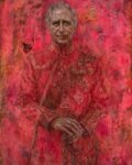
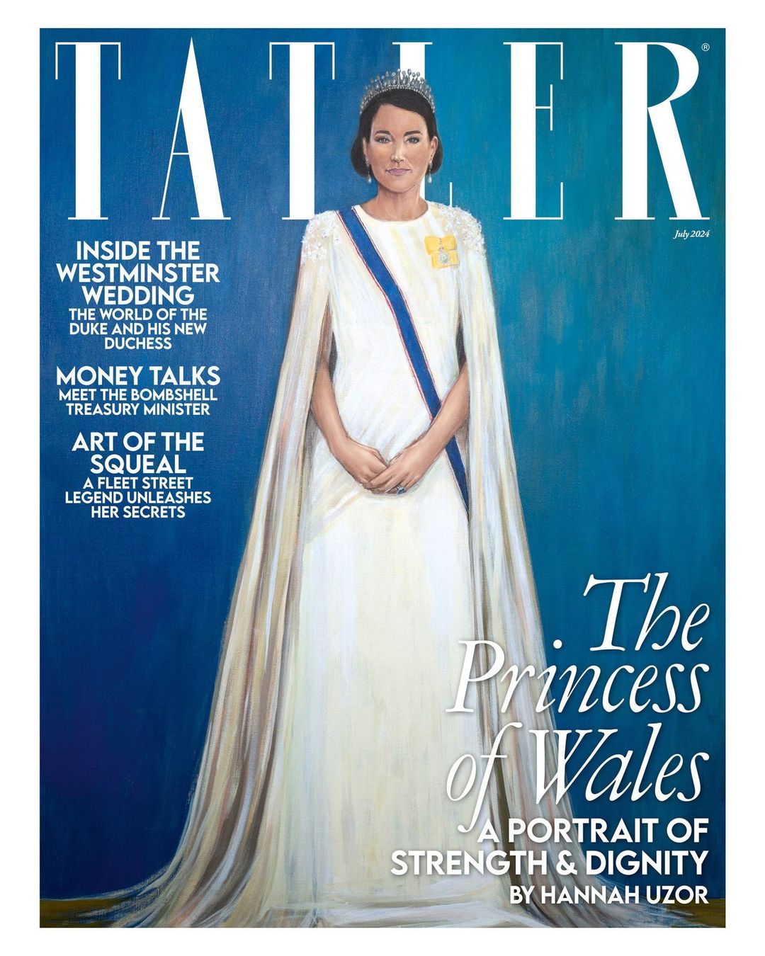
Author: | Filed under: CelebritiesReal talk: the more I look at and evaluate Jonathan Yeo’s “blood-soaked” portrait of King Charles, the more I love it. I’m not pretending to be a professional art critic or anything, but I love the sub-genre of “discussions about artwork done with royals-as-subjects.” Yeo’s portrait of Charles is thought-provoking, evocative and it’s just a really interesting painting overall. The fact that Yeo actually captured Charles is the icing on the cake. Compare Yeo’s portrait to Hannah Uzor’s Tatler-commissioned portrait of the Princess of Wales, and Uzor’s is found wanting. It’s not striking, it doesn’t look like Kate, and the whole piece is so flat and lifeless.
Outrage and opinions followed the unveiling of Yeo’s portrait of the king. Charles’s name was trending on social media for days as everyone dissected the painting. Mainstream, international outlets got in on it too, everyone wanted to talk about Yeo’s portrait. It feels like Tatler is trying to force the same thing about Uzor’s portrait of Kate, only everyone just flatly hates it. The Telegraph’s art critic Alastair Sooke called Uzor’s piece “intolerably bad.” Some of his review:
Sorry, who is she meant to be? The Princess of Wales? You could have fooled me. Even by the standards of modern royal portraiture (and there have been many abominable likenesses of senior members of our royal family produced over the past century), Tatler’s new cover image – an “exclusive” portrait of the Princess of Wales by the British-Zambian artist Hannah Uzor – is egregiously, intolerably, jaw-hits-the-floor bad.
I’ve spent the past hour or so – time, incidentally, that I will never get back – scrutinising Uzor’s “likeness”, and, still, I cannot divine any flicker of resemblance between it and the woman it’s supposed to depict. At first, my editor thought it was meant to represent Meghan, Duchess of Sussex; its subject’s smirk made me think, initially, of Anne Robinson fronting The Weakest Link.
Has there been a flatter, more lifeless royal portrait in living memory? (It’s no surprise to learn that Uzor based her picture on video footage of, rather than personal sittings with, her subject.) Beneath a Lego-like helmet of unmodulated, monotonously brown “hair”, this Princess of Wales has as much charisma as a naff figurine atop a wedding cake.
She holds herself with the bored bearing of an air stewardess about to begin an in-flight safety demonstration – which is additionally awkward, given that this was a job once performed by Catherine’s mother (a fact that, in years gone by, reportedly attracted the ridicule of William’s snobbish friends).
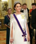
Even her outfit (which she wore to the King’s first state banquet) appears stiff, with that rigid blue sash restricting her like a seatbelt. Her tiara doesn’t sparkle and those diamond-drop earrings fail to shine; towards the image’s bottom edge, her gown seems to disintegrate into streaks of brittle wax, like something desiccated and shrivelled worn by Miss Havisham.
The Miss Havisham reference is WILD, as is the air stewardess reference, OH MY GOD. Sooke really hates the bejesus out of this piece. Someone else who hated it? “Royal commentator” Michael Cole:
Discussing the portrait of The Princess of Wales which appeared on the latest edition of Tatler, Mr Cole told GBNews: “It’s dreadful, isn’t it? It’s as dreadful as Jonathan Yeo’s red portrait of the Red King was brilliant and wonderful.
“It is really a daub, a most dreadful daub. But what Tatler’s doing sticking it on the cover? I have no idea at all. I think she’s got the garter sash right. Everything else is wrong. Certainly the features, certainly the deportment: everything about it. I have no idea why on earth that would be put on the cover of such a long-established, well, it’s the Toff’s bible, isn’t it? Tatler. I don’t know what they’ll think of it at all, and I don’t think it’s helpful either, because at this moment, as we know, Kate, The Princess of Wales, is undergoing treatment for an unspecified cancer.
“To have a picture of her, which might have been done by that man who did The Scream, [Edvard] Munch. Mr Munch might have done this if he’d thought of doing a portrait of the Princess of Wales. Now I think it’s best forgotten. I think it’s one of those magazines you just want to turn it over and see the advert on the back page.”
Some of you suggested something similar, which is that Tatler was being purposefully shady by commissioning this portrait and putting it on the cover. While that’s absolutely a possibility, am I the only one finding this hate for the piece a bit… dramatic and performative? While Uzor’s piece looks nothing like Kate, it’s also not unflattering, per se. It’s not like Uzor depicted Kate as slovenly or squatting down to take a dump. Uzor captured Kate’s authentic “flatness,” her dull two-dimensionality. Maybe that’s why the royalists hate it.
General election? There’s only one debate in Britain right now: where do you stand on the new portrait of the Princess of Wales for the cover of Tatler?
Get the inside scoop in Tatler’s July 2024 issue, on sale 30 May. https://t.co/KZ0QuX1gRS pic.twitter.com/LQVZU0FNj2
— Tatler (@Tatlermagazine) May 23, 2024
Photos courtesy of Cover Images & Avalon Red. Cover courtesy of Tatler, portrait courtesy of Jonathan Yeo.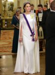



Leave a reply